Project Management
How to Build the Website
Step 1: TOOLS NEEDED
- Installing all the tools necessary for the webpage build:
- Git; Gitlab control
- Github; Webpage server
- Github desktop; To push or pull from the github server and to the github server
- VScode; For writing our documents and code for the website and its pages
- HTML Language: to write the website
- CSS: Corresponds with html. Used to style the website
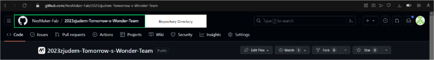
NB: Before we begin, it is worth noting that the GitHub repository had already been setup for our team website by our supervisor. It enables us to upload our website pages to a server for us to edit as team and also setup for others to open and view the work we have done during the course of the module.
Repository Setup for Nexmaker:
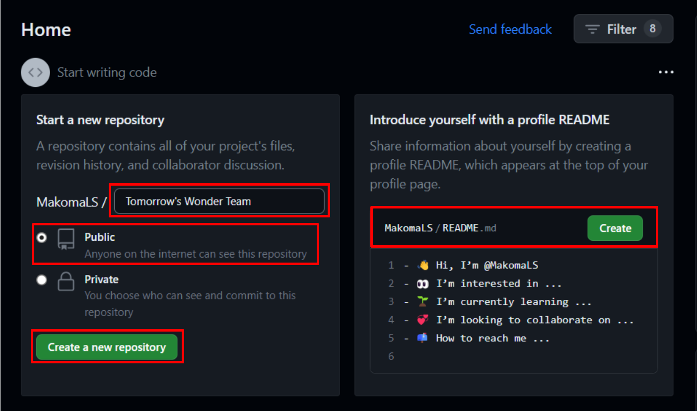
We would like to illustrate how to setup a repository the instructions are as follows: First sign up and create a repository on github.com. Make it public in order to grant access for others to modify. Add a README file for the purpose of writing the website description.
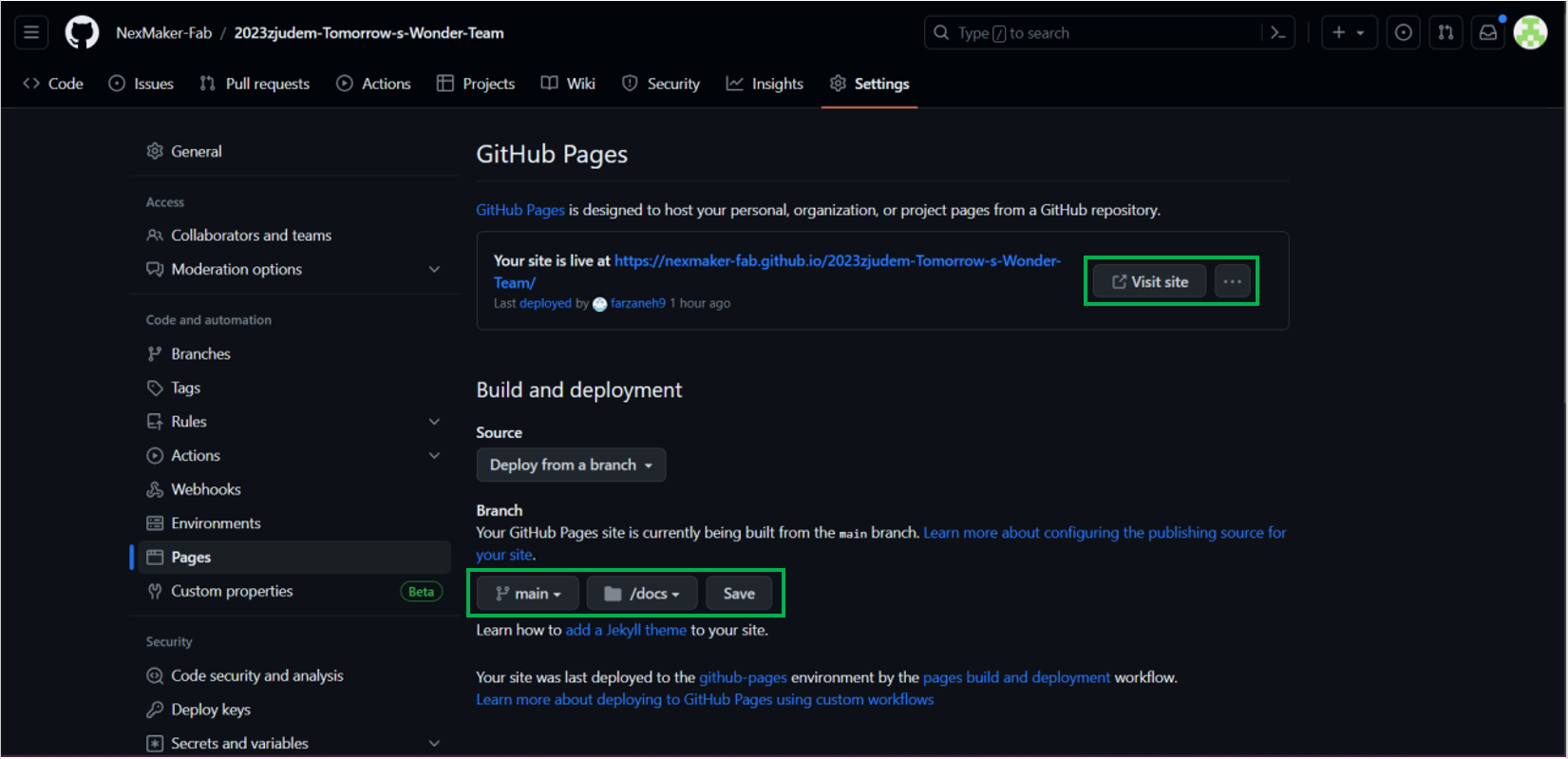
Got to repository settings, in the settings sidebar, select ‘Pages’. In GitHub pages under branch, select main and the ‘/root’ and save. Since the ‘/docs’ folder has not been installed yet, you select root. The setting will be changed to ‘/docs’ later after Docsify install.
Eg:
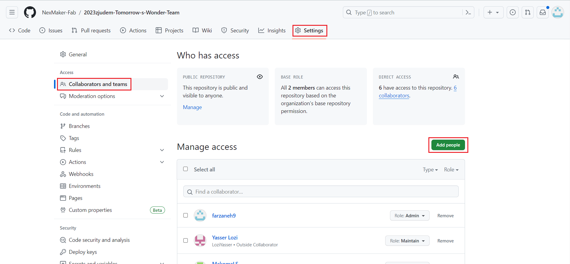
1. Request the username of the person you wish to invite as a collaborator.
2. Access the primary repository page by selecting the repository name on your GitHub dashboard.
3. Click on "Settings" under your repository name. If the "Settings" tab isn't visible, access it through the dropdown menu.
4. Within the sidebar's "Access" section, choose "Collaborators and teams."
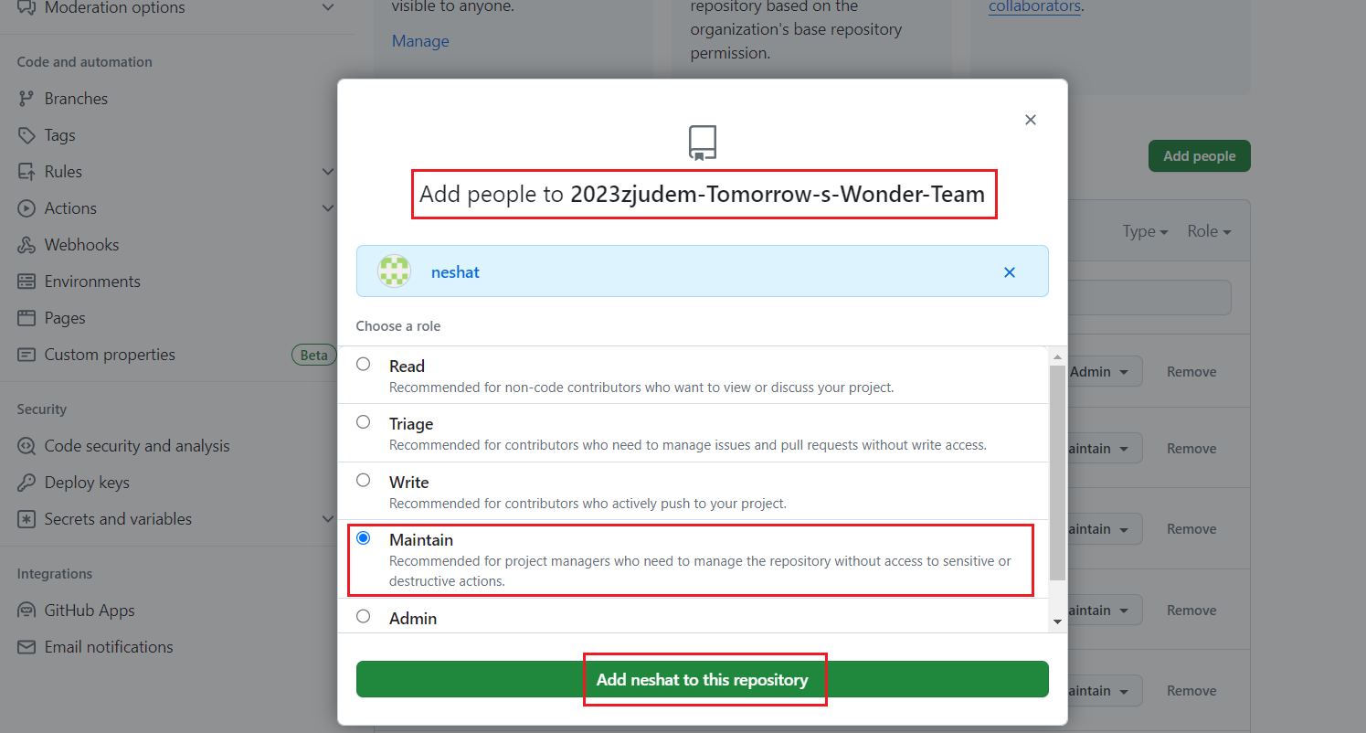
5. Click on "Add people or Add teams" to the right of "Manage access."
6. Initiate a search by entering the name of the team or person. GitHub may auto-suggest usernames; select the correct match.
7. Under "Choose a role," pick the repository role for the team or person, then select "Add NAME to REPOSITORY."
 Removing Access:
Step 1: Navigate to the main repository page.
Step 2: Click on "Settings" under your repository name. If the "Settings" tab isn't visible, access it through the dropdown menu.
Step 3: In the sidebar's "Access" section, go to "Collaborators & teams."
Step 4: Within "Manage access," click "Remove" next to the team or person to revoke their access.
Note: Confirm the action if prompted.
Step 1: Go to the main repository page.
Step 2: Click on "Settings" under your repository name. If the "Settings" tab isn't visible, access it through the dropdown menu.
Step 3: In the sidebar's "Access" section, go to "Collaborators & teams."
Step 4: Within "Manage access," adjust the role by selecting a new role.
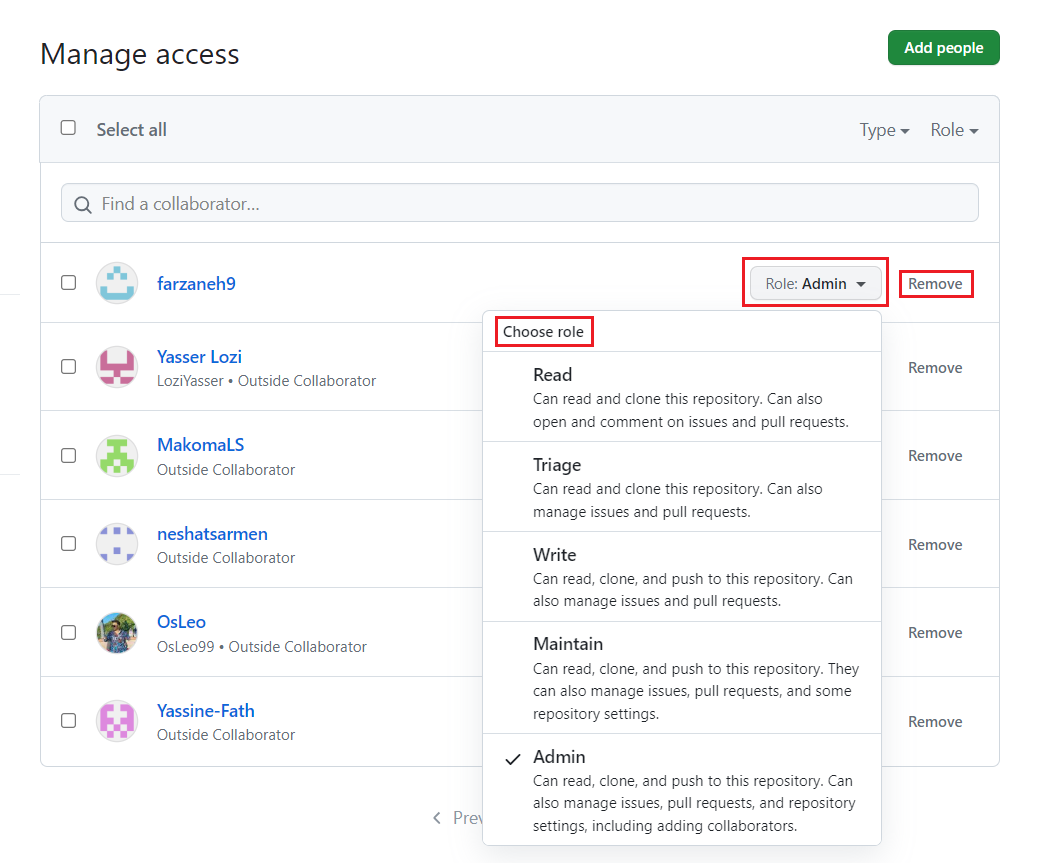
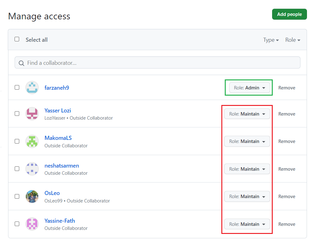
In our website one member is the admin and other members have the maintain role.
 Step 3: LOCAL SETUP
1. Github Desktop
Install Github desktop and sync your account. Clone your repository created earlier and open in Vs Code.
2. Vs Code
Local settings Open Github desktop, clone repository created earlier and open it in Visual Studio Code.

Setting index.html
To set an index.html file, follow these simple steps:
1. Create a new folder on your computer where you want to store your website files.
2. Open a text editor (such as Notepad or VsCode) and create a new file.
3. Save the file with the name "index.html" in the folder you created earlier. Make sure to save it with the ".html" extension.
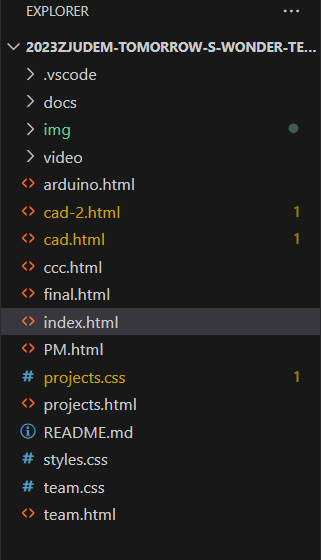
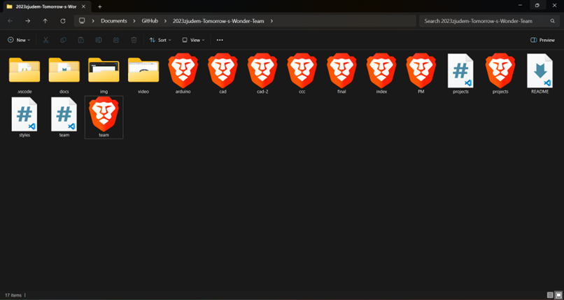
This is an example of how files and folders are organized in VScode.
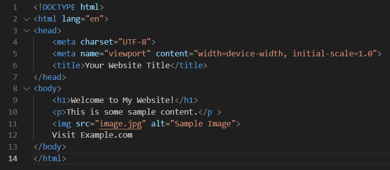
4. Open the index.html file in your text editor.
5. Start by adding the basic structure of an HTML document by typing this code at the top of the file.
< !DOCTYPE html >
6. Below the doctype declaration, add an opening and closing "html" tag:
< html>< /html >
7. Inside the "html" tags, add opening and closing "head" tags:
< head>< /head>
8. Within the "head" tags, you can add various elements such as a title for your webpage using the "title" tag:
< title>Your Website Title< /title>
9. After closing the "head" tags, add opening and closing "body" tags:
< body>< /body>
10. Inside the "body" tags, you can start adding content to your webpage such as headings, paragraphs, images, links, etc.
For example:
Headings:
Use the < h1 > to < h6 > tags for headings. The lower the number, the larger the heading.
    <h1>This is a Heading 1</h1>
     <h2>This is a Heading 2</h2>
     <!-- ... -->
    <h6>This is a Heading 6</h6>
Lists:
Create ordered (numbered) and unordered (bulleted) lists using < ol> and < ul> along with < li> for list items.
    <ul>
     <li>Item 1</li>
     <li>Item 2</li>
     <li>Item 3</li>
    </ul>

    <ol>
     <li>First item</li>
     <li>Second item</li>
     <li>Third item</li>
    </ol>
Links:
Use the < a > tag to create hyperlinks.
<a href="https://www.example.com">Visit Example.com</a>
Add Text
Inside the <body> tag, you can add text using the <p> (paragraph) tag.
<p>This is a paragraph of text on my web page.</p>
Add Images
To add images, use the <img> tag. Specify the src attribute with the path to your image.
<img src="path/to/your/image.jpg" alt="Description of the image">
Divs and Spans
Use <div> for block-level containers and <span> for inline containers. These are often used for grouping and styling purposes.
    <div style="color: blue;">This is a blue block of text.</div>

    <p>This is a <span style="font-weight: bold;">bold</span> word in a paragraph.</p>
Save and View
Save your HTML file and open it in a web browser to see your web page. Right-click on the file and select "Open with" to choose your preferred browser.
Now you have successfully set up an index.html file! You can open it in a web browser to see how it looks or continue adding more content and styling to build your website further.
for more information
Write document and save all under VScode
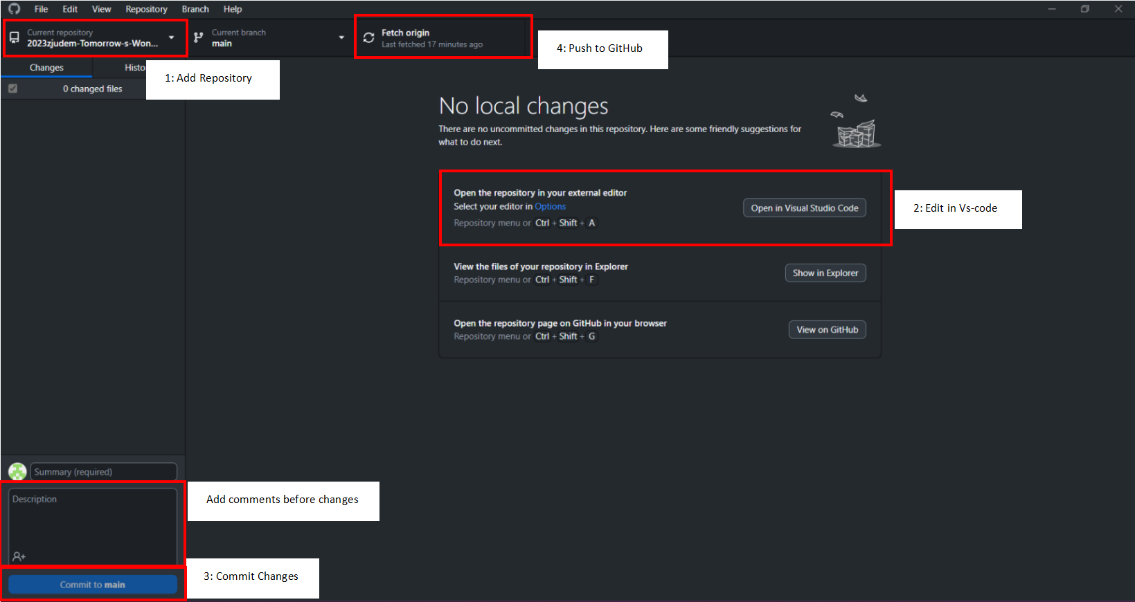
Push to Github
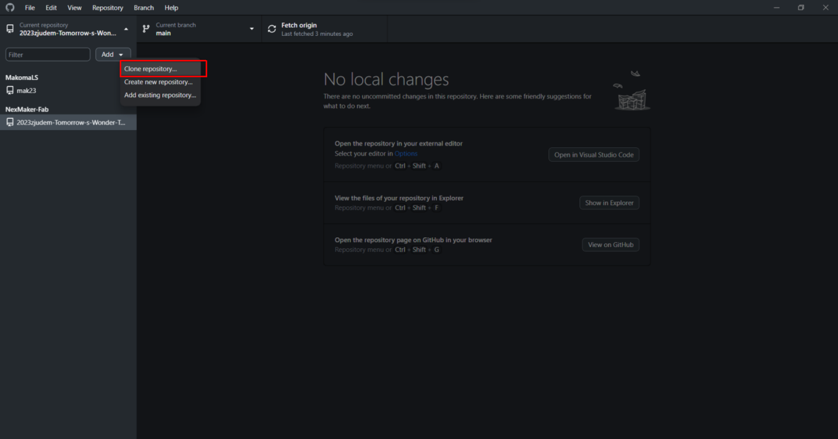
1. Click on the "Clone a repository" button or go to File > Clone Repository.
2. Select the repository you want to work with from the list or enter its URL.
3. Choose a local path where you want to clone the repository on your computer.
4. Click on the "Clone" button to download a copy of the repository to your local machine.
5. Once cloned, you can make changes to files within the repository folder on your computer using any text editor or IDE.
6. Open the GitHub desktop app and you will see a list of changed files under "Changes".
7. Review and select which files you want to commit by checking their checkboxes.
8. Enter a brief summary of your changes in the "Summary" field and provide an optional description in the "Description" field.
9. Click on the "Commit" button to save your changes locally.
10. To push your changes to GitHub, click on "Push origin" at the top right corner of the app window.
That's it! Your changes are now pushed to GitHub using the GitHub desktop app.
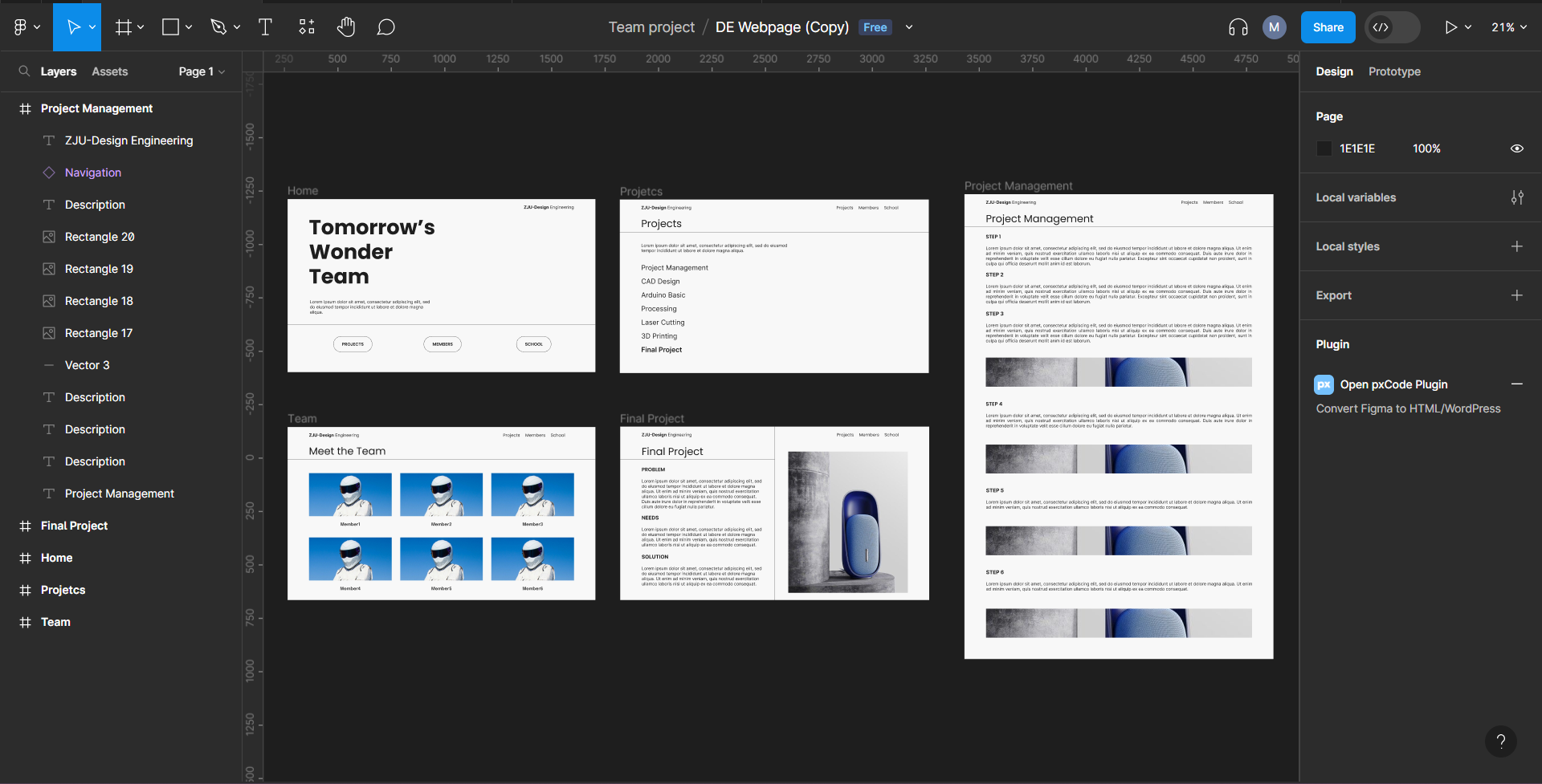
4. Designing in Figma
Figma is a UI design software. We used figma as a basis for what we intend the website design to look like. We also use Figma with the assistance of plugins for the HTML & CSS code then take the necessary measures to make it a working website
a. Designing the website in Figma
Below is a screenshot of the design workflow. Pages are placed side by side with shared elements to ensure continuity in design.
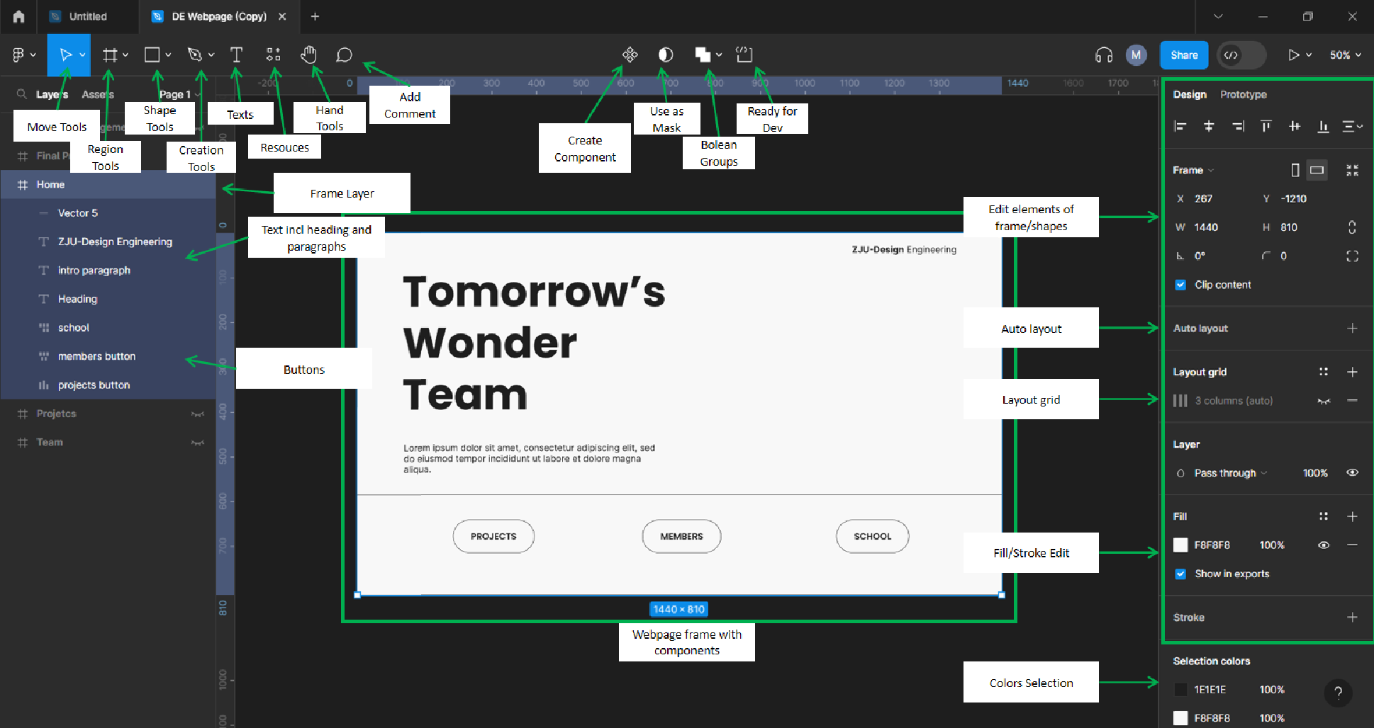
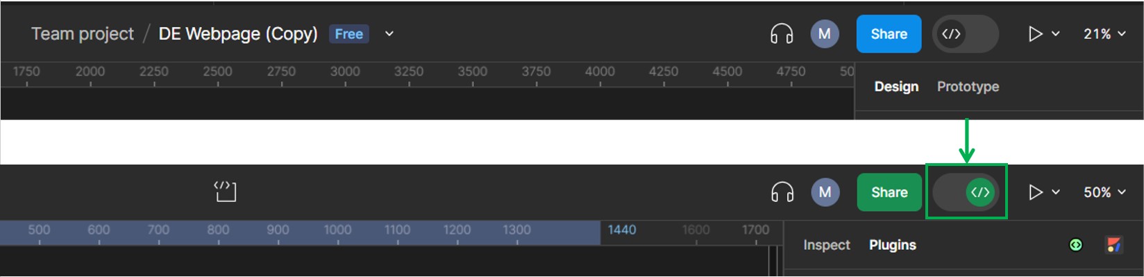
b. We toggle between ‘Design Mode’ and ‘Developer Mode’ in Figma.
Design mode allows us to add elements such as text, images, shapes, layers, colours, etc.
Examples:
 Design mode Toggle for inserting elements in the frame to design the page
In Design Mode, we toggle between Elemental tools, Tabs to organize them and the Design tools sidebar to edit.
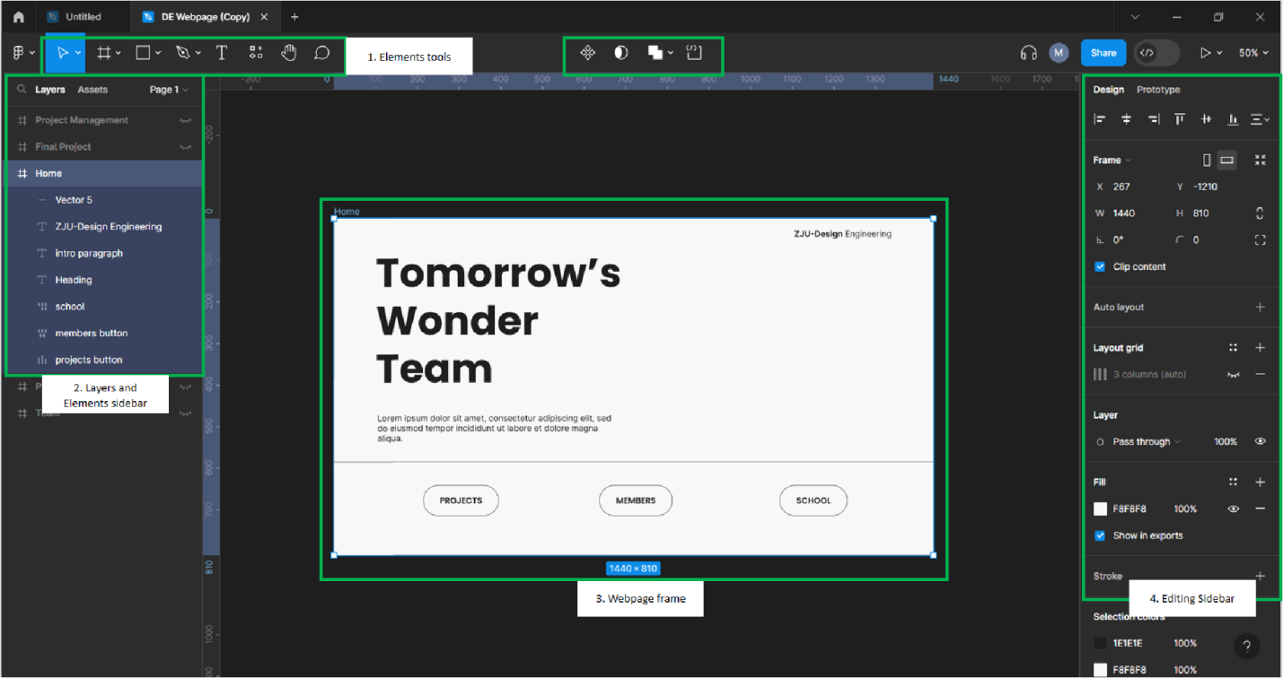
Below is an illustration of how we created the page and various tools used in Figma. By adding elements such as the frame for the page, shapes and texts are layered for the buttons. On the right sidebar, we can view and change various parameters in the design. We can align the text, buttons, shapes, use creation tools to make icons. Edit texts, colors and grids of the page. We played with these various features and reach the result of the prototype for the Landing Page and other supporting website pages .
 Developer mode:

Developer Mode enables us to modify the and preview technical aspects of the UI design. We then take the code export it to Vscode for refining and adding interactive features such as links, and buttons to connected pages
Figma Developer Mode Example :

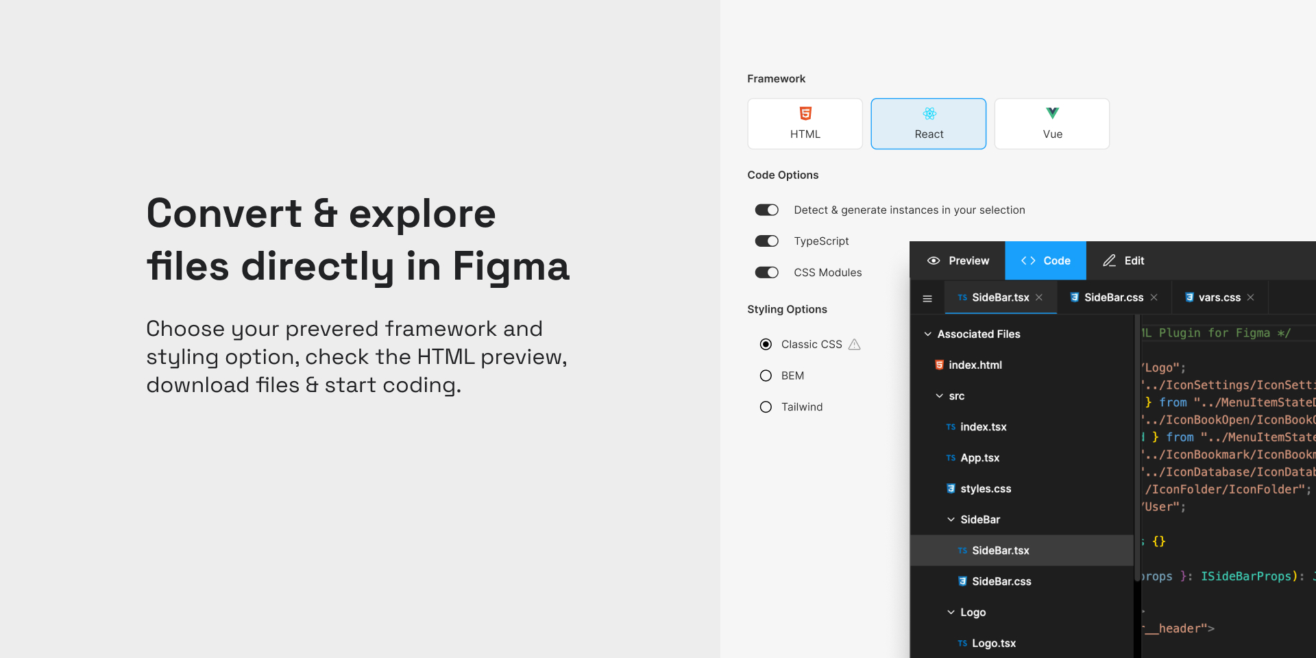
A plugin called “AutoHTML” was used to generate code according to the setup of the page layers and elements. It enables us to view HTML, CSS and JS of the page which can be extracted by copying the code into a new file, or by downloading a compressed folder containing the respective html and css files.
Vscode Import Example:
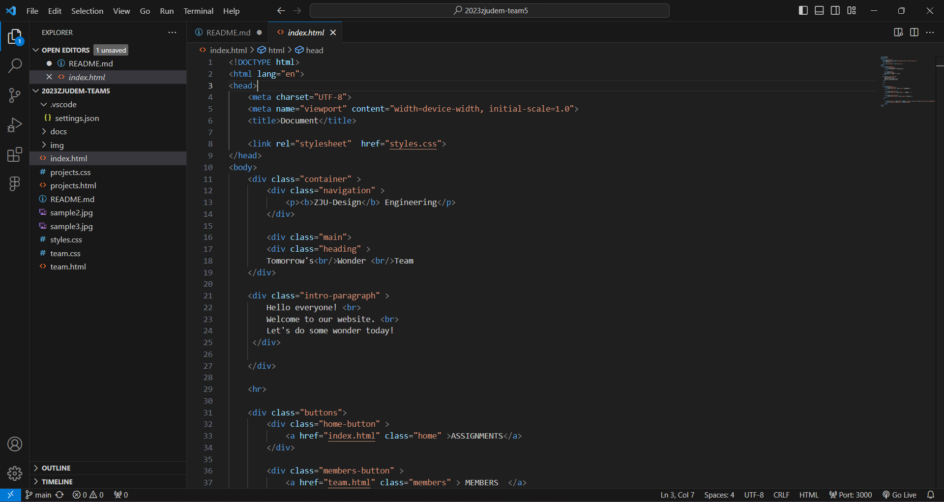 HTML and CSS files pushed to the repository and viewed in vscode. This is where we will edit elements of the pages and continuously add information over the course of the assignments.
How to make a web page using Figma
For A simple instruction using figma for webpage building:
1. On the Figma homepage, we select “Design File” to start designing our page.

2. Setup Your Canvas on right by selecting the type of device you’d like to design on. Since we are working on a web page, we select Desktop for our Frame/Canvas dimensions.
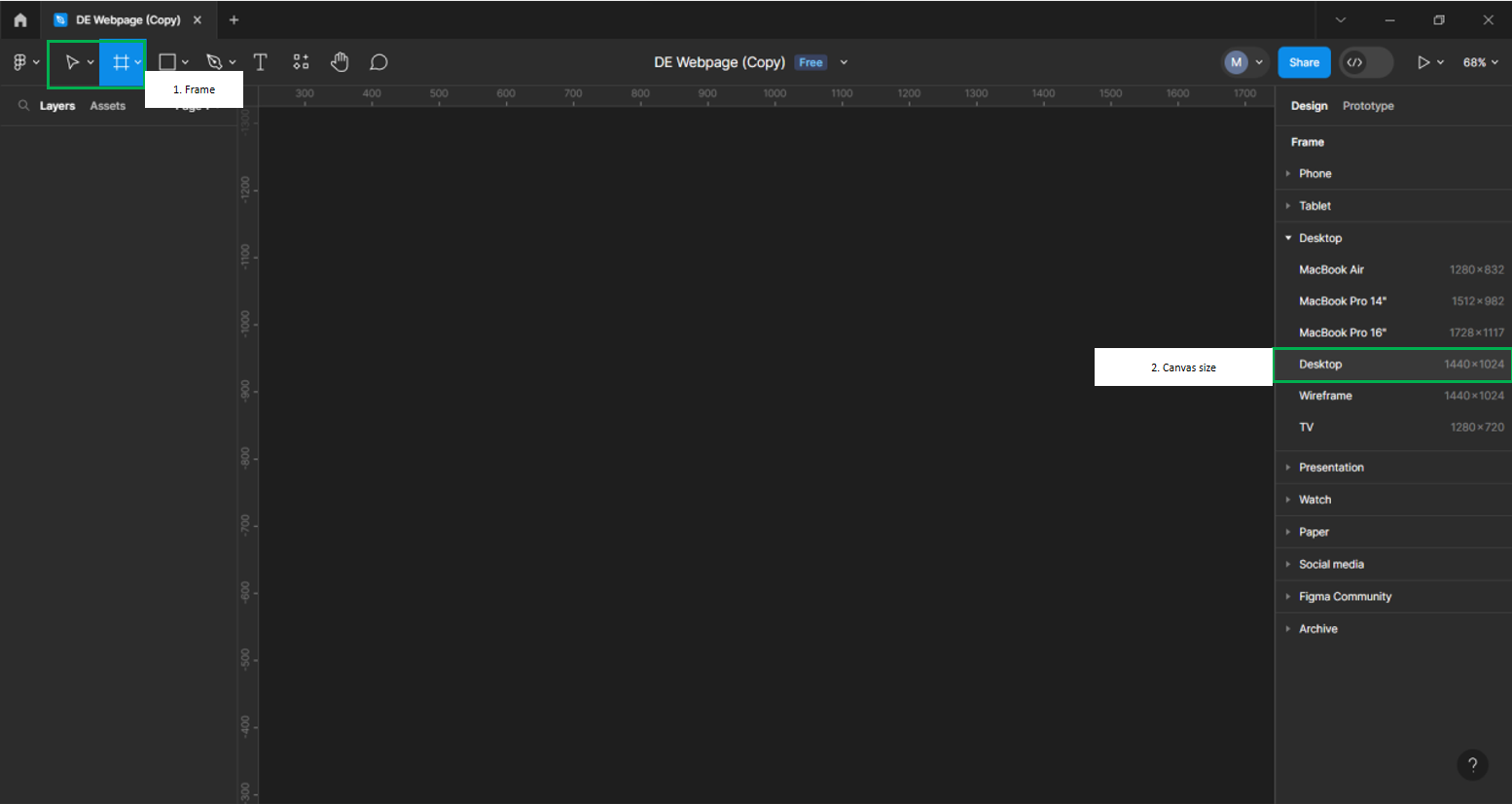
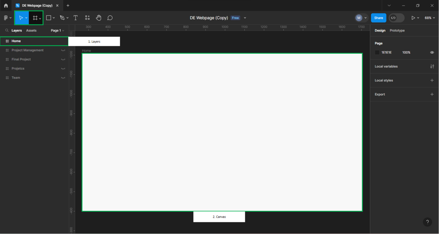
Below, is what is an example of the setup for our Canvas. Selecting Frame sets up its own layers where we will setup the rest of the page.
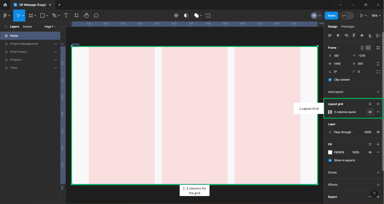
3. Layout Grid
Layouts Grid help us organize the page and give it coherence. We can setup different types of grids be it vertically or horizontally with variety of grid numbers up to 16. since we are keeping the page relatively simple, we are going to work with a grid system of 3.
4. Adding Text
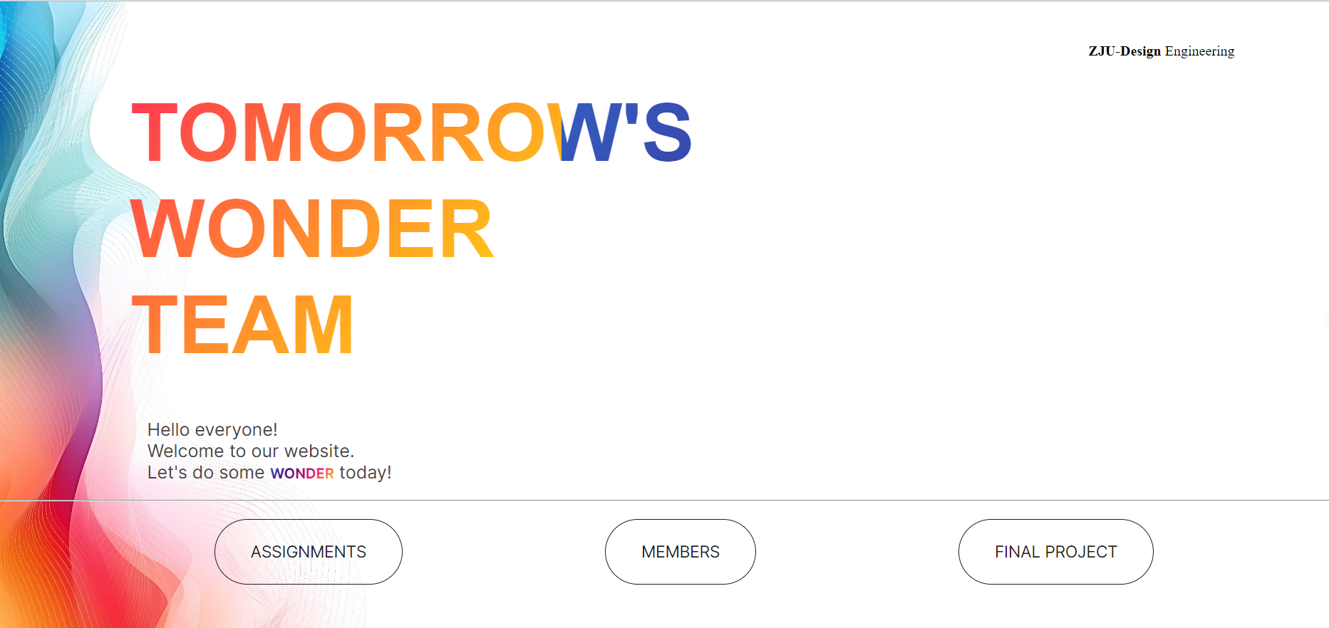
We are adding the Heading for the page and the watermark for with the school and department names. These are simple texts on the landing page designed to capture the visiting user’s attention.
For Modifying texts, we select the text box on the right and adjust various elements including size, fonts type alignment of paragraphs and so forth.
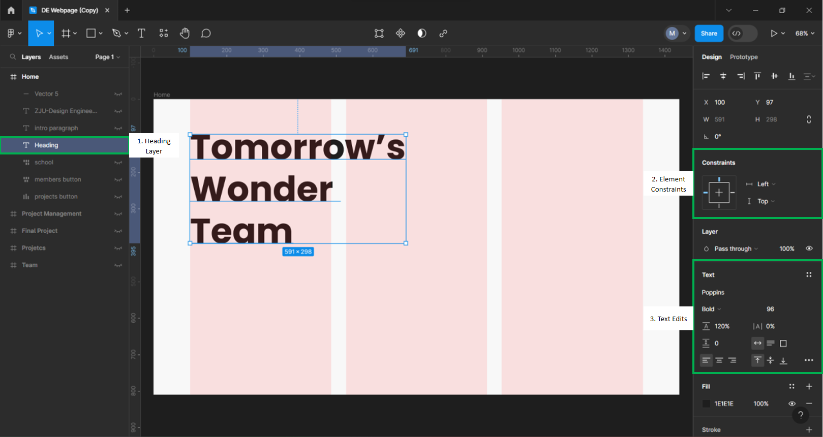
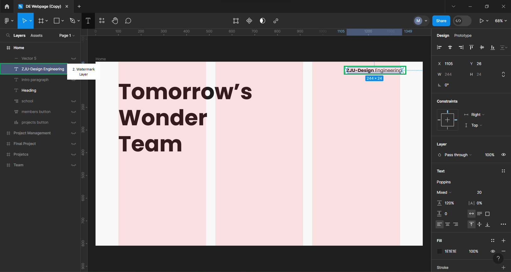 To add, we ensure Constraints are there on the elements to keep them aligned on the page.
5. Buttons
We add buttons for Navigating through to other web pages first we go to the shapes tool and select the rectangle shape. We duplicate twice and align them to form a bottom row. The 3 Grids should assist in center aligning them for us.
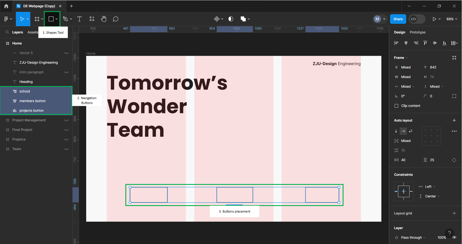 Then we round the edges of the buttons using corner radius by value of 80 under the design shapes tool. This will ensure we have a uniform look for our system.
Afterwards, we add texts to our buttons. To achieve this, we add text like before but group them with the rounded shapes we created. In formatting, we use the same font type as the header and adjust the size to 20points as to fit well in the box. Then, we align the text with the using constraints and name the buttons according to the page we want them to correspond with such as Project, Members & School.
See examples below:
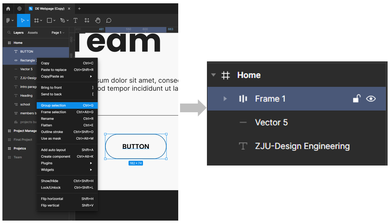
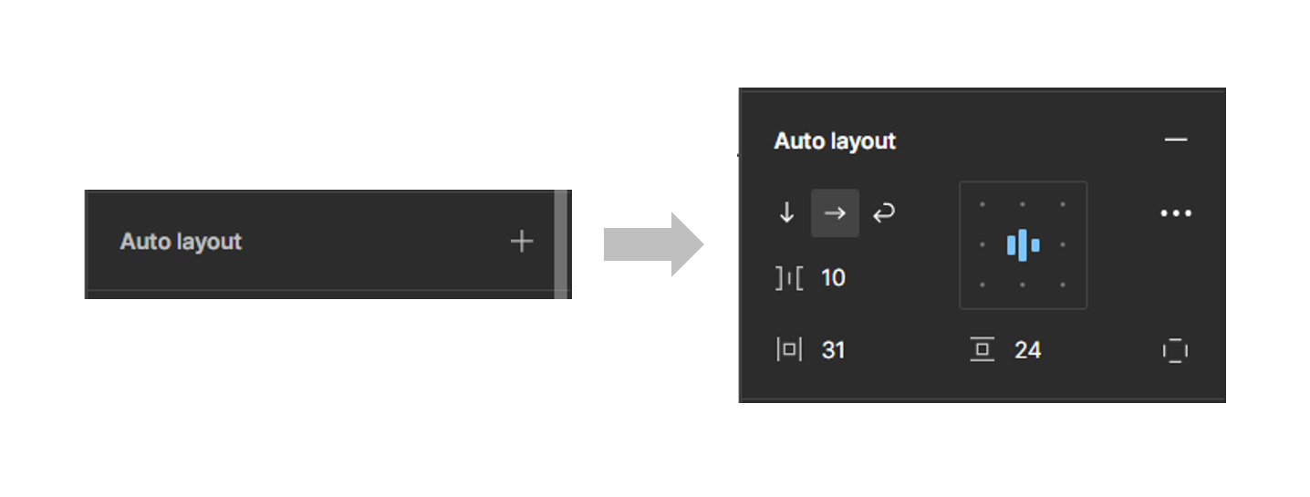
Select both ‘Button’ text and Rectangle Layer. Select ‘Group selection’ to group layers. To complete the button, we add an ‘Auto Layer’ to complete the button. The auto layer should help align the button according to the page.
 We can either repeat the process for the remaining buttons, or simply duplicate and rename then to suit your needs.
Example:
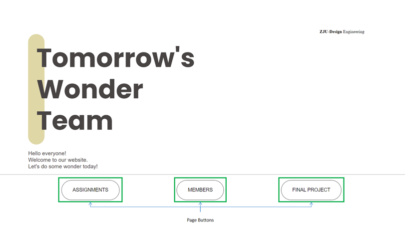
.png) Note: For the final page, the buttons and names have been adjusted to ‘Assignment’, ‘Members’ & ‘Final Project’.
Note: For the final page, the buttons and names have been adjusted to ‘Assignment’, ‘Members’ & ‘Final Project’.
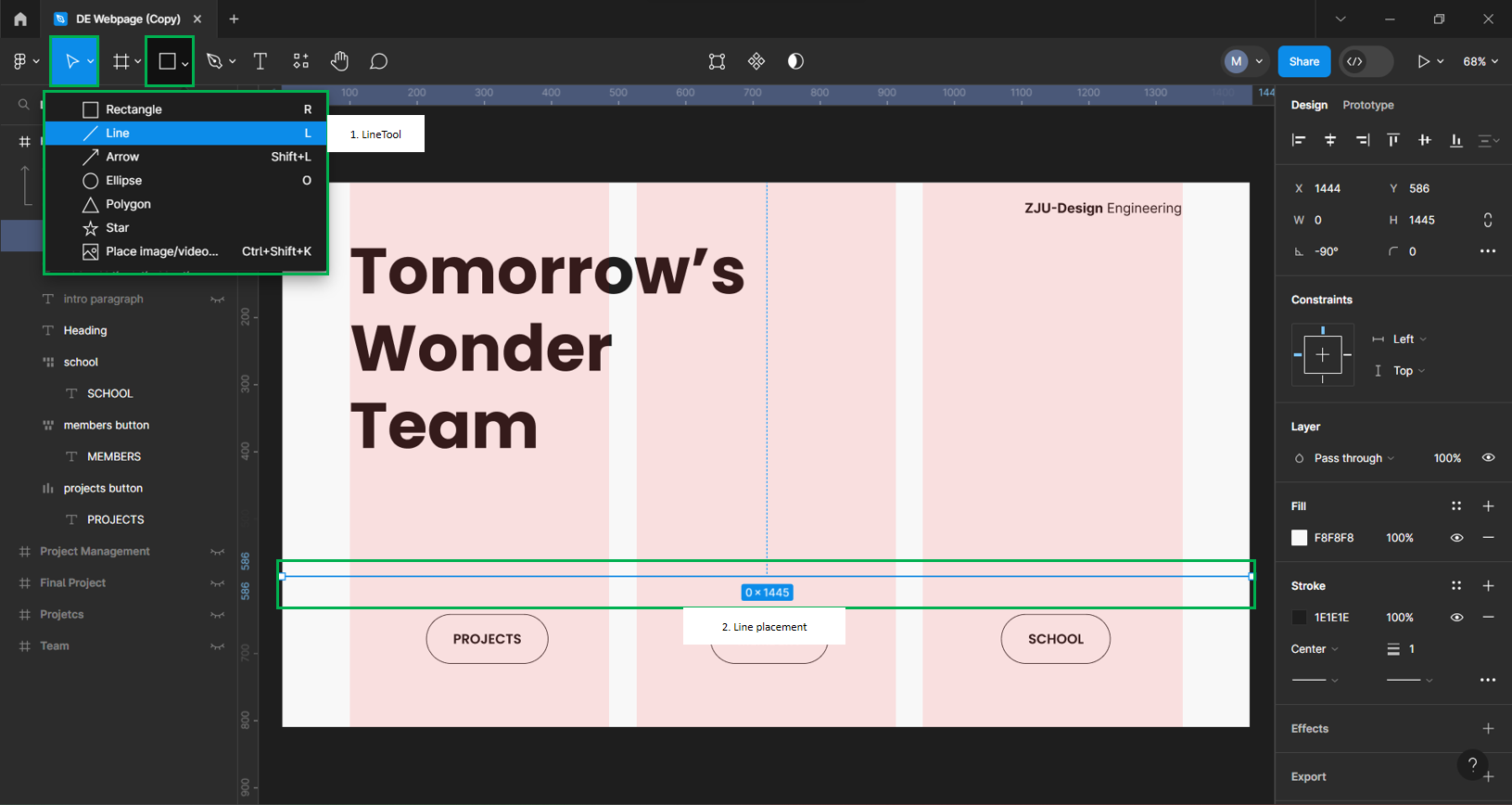
Use the Line tool as a way to divide the landing page into two sections separating the headers and the buttons. Under the shape tool, select ‘Line’ then press shift and click the cursor from end and drag to the other to draw a horizontal line.
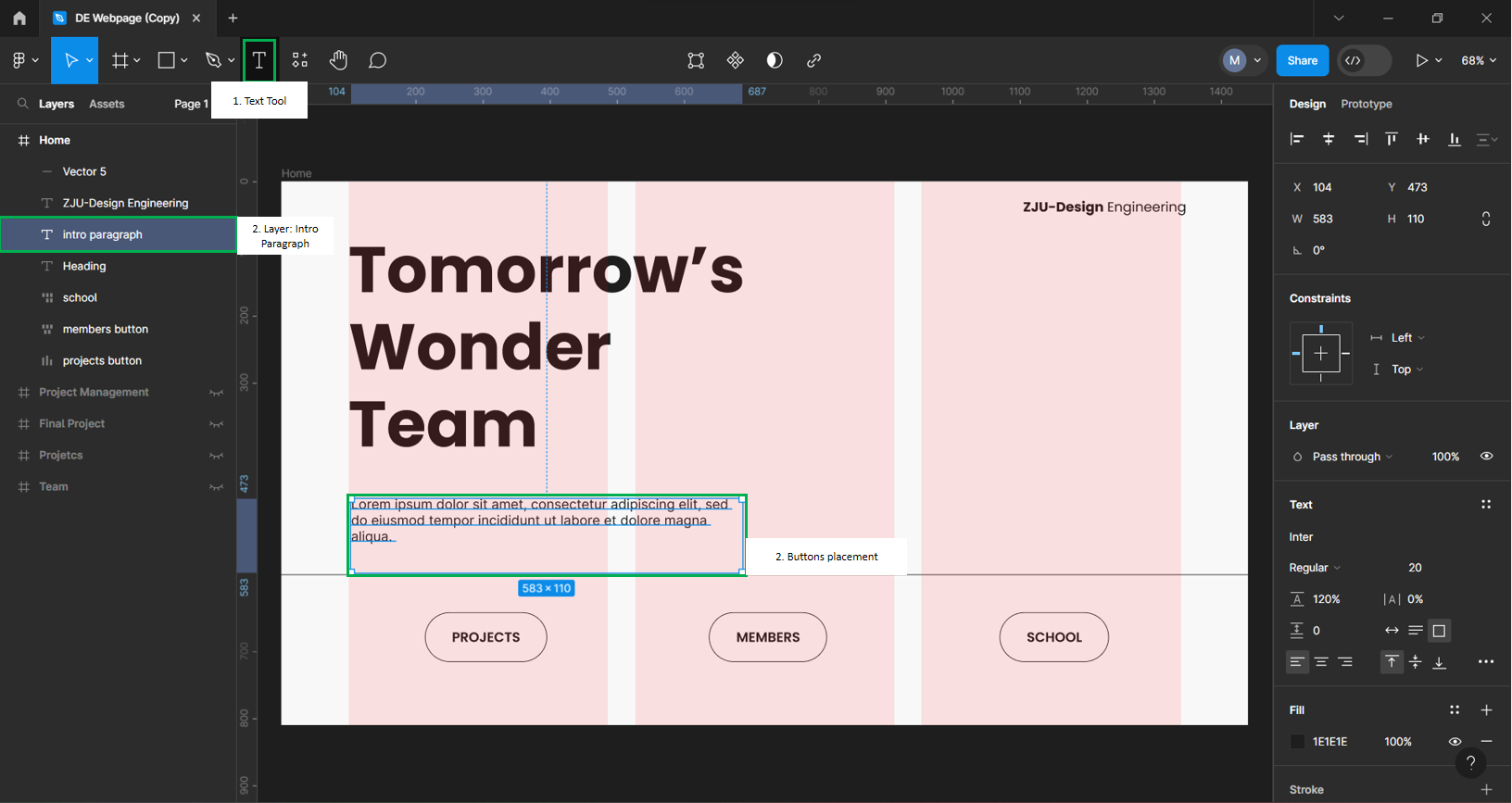
 Lastly, add a paragraph to complete the page. Like before with the Title Header, we use the ‘Text tool’ and align the paragraph to the left. Keep the font ‘Poppins’ and regular type for style coherence in the site and font size should be kept at 20points. To align the text box on the page, align according to the Grid system edge along with the Title Header.
This paragraph will work as an introduction to the teams website be it a welcome message or a description of the work done from the team.
Linking Pages
For Linking the Webpages, Figma was not used as the AutoHTML plugin did not have the function. Instead, the files were Pulled through VScode and the edit was made from there to link web pages together. Each page is linked to one another using HTML. The example shown will link the Assignments, Members and Final Projects page from the Home Index.html Page.
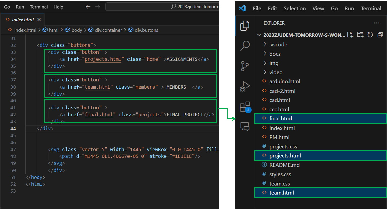
The Code connecting ‘projects.html’, ‘team.html’, ‘final.html’ pages from the Home ‘index.html’ page is as follows:
    <div class="menu-items" >
        <a href="index.html" class="nav-link projects" >
        Home
        </a>
        <a href="projects.html" class="nav-link projects" >
        Assignments
        </a>
        <a href="team.html" class="nav-link members" >
        Members
        </a>
        <a href="final.html" class="nav-link school">
        Final Project
        </a>
    </div>
Above is the screenshot of the Cloned Github Folder. The only way the files of the pages is read is provided that they are within the same folder. This way, the link in the HTML code reads the files by default.
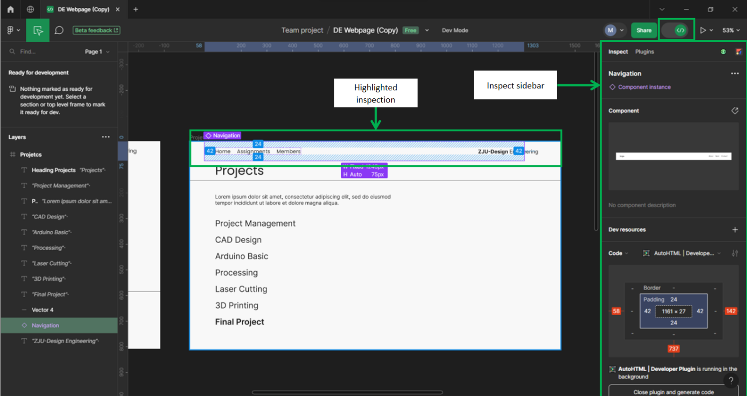
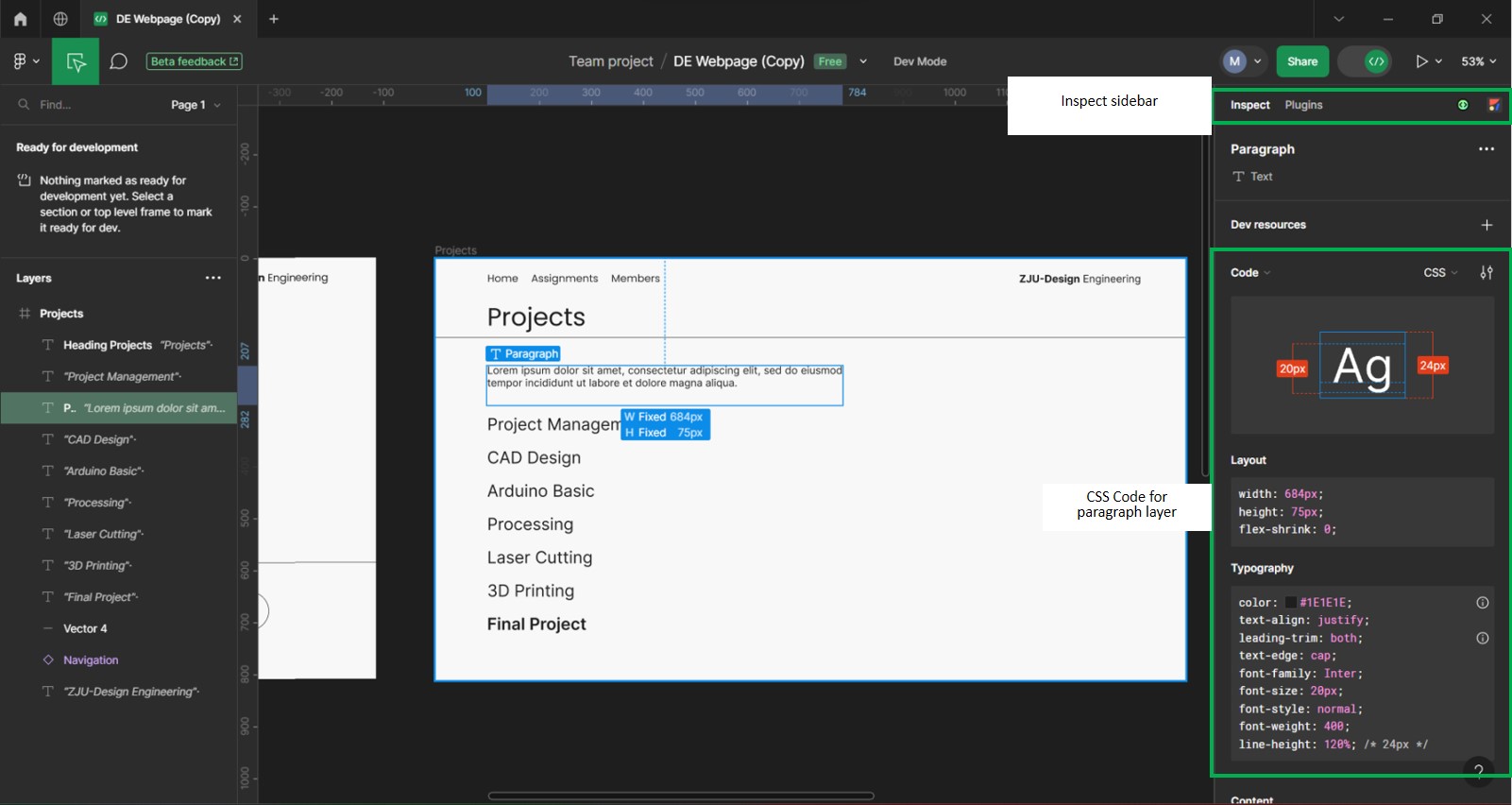
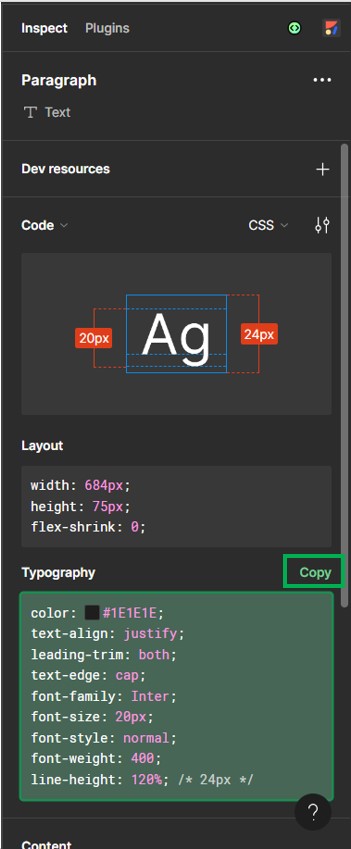
Figma Dev Mode Explained: Your Design Inspector

Dev Mode is a dedicated space for developers to inspect, understand, and translate designs into code, much like a browser inspector for websites.
Here's what you can do with Figma Dev Mode:
Inspect like a pro: Hover over layers and see detailed information like measurements, styles, and code snippets. No Need to dig through menus or guessing specs.
Copy styles and tokens: Easily grab CSS or Sass code for colors, fonts, and other styles. Use them directly in your code or create a central style sheet for consistency.
Component magic: Inspect and export reusable components with their code, variants, and properties. This speeds up development and keeps your codebase organized.
Getting Started with Figma Dev Mode:
Open the Dev Mode panel: Click the icon in the top right corner of your Figma window.
Select a layer: Click on any layer in your design to inspect its details.
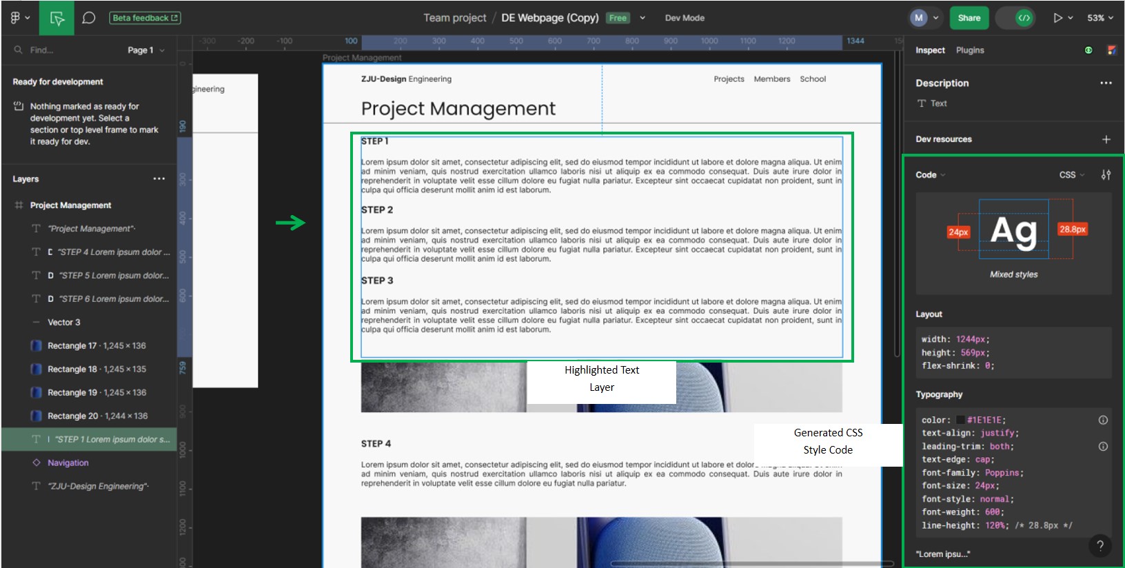
Explore the panels: You'll see panels for Code, Styles & Tokens, Layers, and Properties. Each one gives you specific information and tools.
Copy-paste or generate code: Use the Copy Code button for individual styles or tokens, or the Generate Code button for the entire frame or selected components. Choose your preferred format (React, Vue, etc.).
Example using a paragraph layer:
*As of this writing, Figma Dev Mode is still in beta.
AUTOHTML
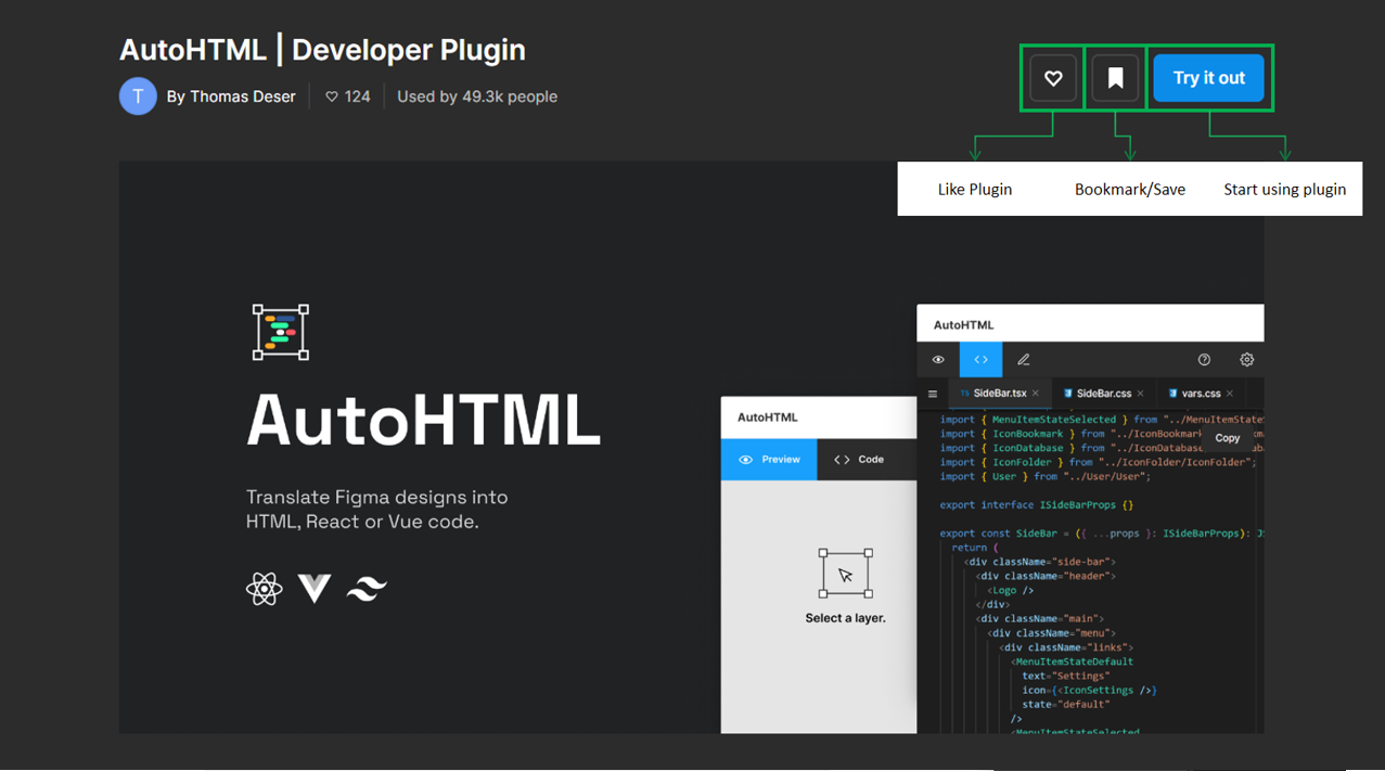
The AutoHTML plugin for Figma is a powerful tool designed to bridge the gap between design and development. It streamlines the process of converting your Figma designs into clean, production-ready HTML code.
Exporting with ease:
Select a frame in your Figma design and run the plugin. AutoHTML analyzes your layers, styles, and components, and automatically generates the corresponding HTML code.
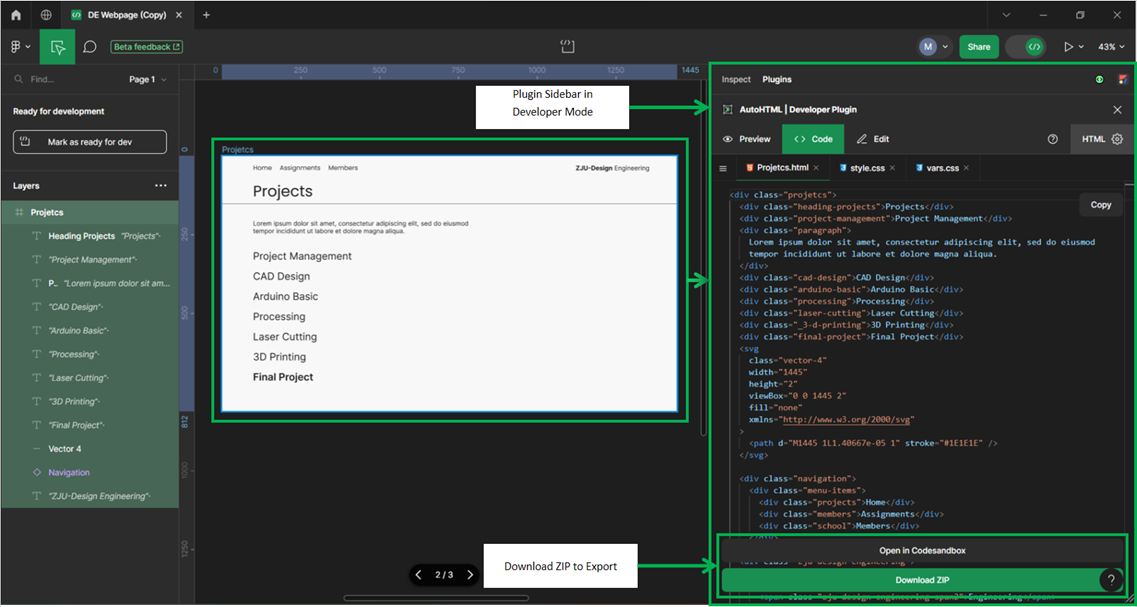
No need for manual coding or tedious copy-pasting. AutoHTML takes care of the heavy lifting, saving you valuable time and effort.
Clean and organized code:
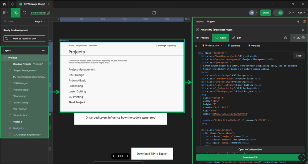
The generated code is well-structured, easy to read, and follows best practices. You get a solid foundation to build upon, whether you're working with React, Vue, or plain HTML.
AutoHTML ensures your code is maintainable and scalable, making future modifications and collaboration a breeze.
Example:
    <div class="projetcs">
        <div class="heading-projects">Projects</div>
        <div class="project-management">Project Management</div>
        <div class="paragraph">
          Lorem ipsum dolor sit amet, consectetur adipiscing elit, sed do eiusmod
          tempor incididunt ut labore et dolore magna aliqua.
        </div>
        <div class="cad-design">CAD Design</div>
        <div class="arduino-basic">Arduino Basic</div>
        <div class="processing">Processing</div>
        <div class="laser-cutting">Laser Cutting</div>
        <div class="_3-d-printing">3D Printing</div>
        <div class="final-project">Final Project</div>
        <svg
          class="vector-4"
          width="1445"
          height="2"
          viewBox="0 0 1445 2"
          fill="none"
          xmlns="http://www.w3.org/2000/svg"
        >
          <path d="M1445 1L1.40667e-05 1" stroke="#1E1E1E" />
        </svg>

        <div class="navigation">
          <div class="menu-items">
            <div class="projects">Home</div>
            <div class="members">Assignments</div>
            <div class="school">Members</div>
          </div>
        </div>
        <div class="zju-design-engineering">
          <span>
            <span class="zju-design-engineering-span">ZJU-Design</span>
            <span class="zju-design-engineering-span2">Engineering</span>
          </span>
        </div>
      </div>
Style with efficiency:
Color styles, text styles, and effect styles are automatically converted into CSS variables. This promotes consistency and flexibility, allowing you to easily update styles across your entire codebase. CSS classes are named logically, based on the corresponding layers in your Figma design. This makes it intuitive to map your design elements to their code counterparts.
      .projetcs,
      .projetcs * {
        box-sizing: border-box;
      }
      .projetcs {
        background: #f8f8f8;
        width: 1445px;
        height: 812px;
        position: relative;
        overflow: hidden;
      }
      .heading-projects {
        color: #1e1e1e;
        text-align: left;
        font-family: "Poppins-Regular", sans-serif;
        font-size: 48px;
        line-height: 120%;
        font-weight: 400;
        position: absolute;
        left: 100px;
        top: 95px;
        width: 684px;
      }
      .project-management {
        color: #1e1e1e;
        text-align: left;
        font-family: "Inter-Regular", sans-serif;
        font-size: 32px;
        line-height: 200%;
        font-weight: 400;
        position: absolute;
        left: 100px;
        top: 286px;
        width: 388px;
        display: flex;
        align-items: flex-end;
        justify-content: flex-start;
      }
      .paragraph {
        color: #1e1e1e;
        text-align: justified;
        font-family: "Inter-Regular", sans-serif;
        font-size: 20px;
        line-height: 120%;
        font-weight: 400;
        position: absolute;
        left: 100px;
        top: 207px;
        width: 684px;
        height: 75px;
      }
      .cad-design {
        color: #1e1e1e;
        text-align: left;
        font-family: "Inter-Regular", sans-serif;
        font-size: 32px;
        line-height: 200%;
        font-weight: 400;
        position: absolute;
        left: 100px;
        top: 350px;
        width: 388px;
        display: flex;
        align-items: flex-end;
        justify-content: flex-start;
      }
      .arduino-basic {
        color: #1e1e1e;
        text-align: left;
        font-family: "Inter-Regular", sans-serif;
        font-size: 32px;
        line-height: 200%;
        font-weight: 400;
        position: absolute;
        left: 100px;
        top: 414px;
        width: 388px;
        display: flex;
        align-items: flex-end;
        justify-content: flex-start;
      }
      .processing {
        color: #1e1e1e;
        text-align: left;
        font-family: "Inter-Regular", sans-serif;
        font-size: 32px;
        line-height: 200%;
        font-weight: 400;
        position: absolute;
        left: 100px;
        top: 478px;
        width: 388px;
        display: flex;
        align-items: flex-end;
        justify-content: flex-start;
      }
      .laser-cutting {
        color: #1e1e1e;
        text-align: left;
        font-family: "Inter-Regular", sans-serif;
        font-size: 32px;
        line-height: 200%;
        font-weight: 400;
        position: absolute;
        left: 100px;
        top: 542px;
        width: 388px;
        display: flex;
        align-items: flex-end;
        justify-content: flex-start;
      }
      ._3-d-printing {
        color: #1e1e1e;
        text-align: left;
        font-family: "Inter-Regular", sans-serif;
        font-size: 32px;
        line-height: 200%;
        font-weight: 400;
        position: absolute;
        left: 100px;
        top: 606px;
        width: 388px;
        display: flex;
        align-items: flex-end;
        justify-content: flex-start;
      }
      .final-project {
        color: #1e1e1e;
        text-align: left;
        font-family: "Inter-SemiBold", sans-serif;
        font-size: 32px;
        line-height: 200%;
        font-weight: 600;
        position: absolute;
        left: 100px;
        top: 670px;
        width: 388px;
        display: flex;
        align-items: flex-end;
        justify-content: flex-start;
      }
      .vector-4 {
        width: 0px;
        height: 1445px;
        position: absolute;
        left: 1445px;
        top: 152px;
        transform: translate(-1445px, -0.5px);
        overflow: visible;
      }
      .navigation {
        padding: 24px 42px 24px 42px;a
        display: flex;
        flex-direction: row;
        gap: 24px;
        align-items: flex-start;
        justify-content: flex-start;
        flex-wrap: wrap;
        width: 1245px;
        position: absolute;
        right: 142px;
        top: 0px;
      }
      .menu-items {
        display: flex;
        flex-direction: row;
        gap: 24px;
        align-items: center;
        justify-content: flex-end;
        flex-shrink: 0;
        position: relative;
      }
      .projects {
        color: var(--black, #2d2d2d);
        text-align: right;
        font-family: "Poppins-Regular", sans-serif;
        font-size: 20px;
        line-height: 27px;
        font-weight: 400;
        position: relative;
        display: flex;
        align-items: center;
        justify-content: flex-end;
      }
      .members {
        color: var(--black, #2d2d2d);
        text-align: right;
        font-family: "Poppins-Regular", sans-serif;
        font-size: 20px;
        line-height: 27px;
        font-weight: 400;
        position: relative;
        display: flex;
        align-items: center;
        justify-content: flex-end;
      }
      .school {
        color: var(--black, #2d2d2d);
        text-align: right;
        font-family: "Poppins-Regular", sans-serif;
        font-size: 20px;
        line-height: 27px;
        font-weight: 400;
        position: relative;
        display: flex;
        align-items: center;
        justify-content: flex-end;
      }
      .zju-design-engineering {
        color: #1e1e1e;
        text-align: left;
        font-family: "-", sans-serif;
        font-size: 20px;
        line-height: 120%;
        font-weight: 400;
        position: absolute;
        right: 86px;
        top: 27px;
        transform-origin: 0 0;
        transform: rotate(0deg) scale(1, 1);
      }
      .zju-design-engineering-span {
        color: #1e1e1e;
        font-family: "Inter-Bold", sans-serif;
        font-size: 20px;
        line-height: 120%;
        font-weight: 700;
      }
      .zju-design-engineering-span2 {
        color: #1e1e1e;
        font-family: "Inter-Regular", sans-serif;
        font-size: 20px;
        line-height: 120%;
        font-weight: 400;
      }
AutoHTML eliminates the need for repetitive coding and manual adjustments. Focus on the creative aspects of front-end development and let the plugin handle the grunt work.
It's a perfect tool for designers and developers alike. Designers can quickly share their vision with developers, and developers can get started on coding right away with a solid foundation.
Overall, AutoHTML simplifies the design-to-code workflow, saves time, and increases efficiency. For either a seasoned developer or new to coding, this plugin is valuable to the Figma toolkit.
Currently, we apply changes on our website in VSCode mostly by using HTML and CSS.